Case Study: Cyclistic Bike-Share Data Analysis Case Study Using Python
![]()
Introduction
For this case study, I analyzed 12 months of bike-share data from Chicago using Python to understand how different types of customers used bikes differently and what those differences suggest for converting casual riders into annual members.
The analysis revealed key differences between members and casual riders:
- Members take more rides overall and show strong weekday commute patterns, with peaks around 8 a.m. and 5 p.m.
- Casual riders are most active during warmer months and on weekends, tend to take slightly longer trips, and cluster more near the lakeshore.
These findings support strategies focused on converting casual riders during peak riding season, offering weekend/seasonal membership options, and targeting casual rider hotspots.
Project highlights:
Background
Cyclistic is a bike-share company in Chicago with two types of customers:
- Casual riders—customers who purchase single-ride or full-day passes
- Members—customers who purchase annual memberships
Cyclistic’s finance analysts have concluded that annual members are much more profitable than casual riders. Because of this, the director of marketing believes the company’s long-term growth depends on increasing the number of annual memberships.
To support that goal, the marketing analytics team wants to better understand how casual riders and annual members use Cyclistic bikes differently. Using these insights, the team will design new marketing strategies aimed at converting casual riders into annual members.
Goal
The overall goal of the marketing analytics team is this:
Design marketing strategies aimed at converting casual riders into annual members.
Three questions will guide the future marketing program:
- How do annual members and casual riders use Cyclistic bikes differently?
- Why would casual riders buy Cyclistic annual memberships?
- How can Cyclistic use digital media to influence casual riders to become members?
For this case study, I focused on the first question: How do annual members and casual riders use Cyclistic bikes differently?
Business Task
To address this question, I completed the following business task:
Analyze historical bike trip data to identify trends in how annual members and casual riders use Cyclistic bikes differently.
Data Source
The data used in this case study is publicly available historical bike-share trip data owned by the City of Chicago. It can be accessed here and is provided by Motivate International Inc. under this license.
For this analysis, I used the most recent 12 months of available data, covering 2024-11-01 to 2025-10-31.
The data is stored across 12 CSV files, one for each month. Each row is a record of a bike trip (identified by a unique ride_id), and each column is a field describing the trip.
The dataset consists of 13 fields:
| # | Field Name | Description |
|---|---|---|
| 01 | ride_id |
Unique trip identifier |
| 02 | rideable_type |
Bike type (‘classic’ or ‘electric’) |
| 03 | started_at |
Trip start date and time |
| 04 | ended_at |
Trip end date and time |
| 05 | start_station_name |
Start station name |
| 06 | start_station_id |
Start station ID |
| 07 | end_station_name |
End station name |
| 08 | end_station_id |
End station ID |
| 09 | start_lat |
Start latitude |
| 10 | start_lng |
Start longitude |
| 11 | end_lat |
End latitude |
| 12 | end_lng |
End longitude |
| 13 | member_casual |
Membership type (‘member’ or ‘casual’) |
Data Integrity
In terms of data integrity, this dataset ROCCCs:
- Reliable—It is reasonable to assume the data is trustworthy and unbiased for the purposes of this case study.
- Original—The data is sourced directly from the City of Chicago and Motivate International Inc., the original owners and operators (first-party source).
- Comprehensive—The data contains the necessary records and fields for this analysis.
- Current—The dataset includes historical records for several years, including the relevant records from the past 12 months.
- Cited—The data is made available under a public license from the City of Chicago and Motivate International Inc.
Methodology
The tools and workflow used for this project were informed by both the business task and the dataset itself.
Tools
The combined dataset contains 5,569,279 rows, making it too large for standard spreadsheet software. (Microsoft Excel is limited to roughly 1 million rows, for example.)
For this project, I used Python throughout since it’s super powerful and versatile and can be used end-to-end for cleaning, transformation, analysis, and visualization. Plus, Python is fun, and I wanted to practice using it for data analysis.
I used Spyder 6 as my IDE because it includes features especially useful for scientific data analysis. My environment uses Python 3.12 with the following core libraries:
numpyandpandasfor data manipulation and analysismatplotlib,seaborn, andplotlyfor data visualization
Workflow
To make things easier, I refactored the workflow into three scripts:
_1_data_cleaning.py- Combines, cleans, and transforms data for analysis, and exports it as a CSV file.
_2_analysis_and_viz.py- Performs statistical analysis and generates static visualizations.
_3_build_ride_map.py- Builds a dynamic map visualizing ride start and end locations by membership status.
In addition, the project includes a config.py file to define global file paths and a custom .mplstyle file for consistent visualization styling.
Data Cleaning and Preparation
To prepare the data for analysis, I first loaded and combined the data from all 12 monthly CSV files into a single dataset.
raw_csv = sorted(config.RAW_PATH.glob('*.csv'))
if not raw_csv:
    raise FileNotFoundError(f'No CSV files found in {config.RAW_PATH}')

df = pd.concat([pd.read_csv(f) for f in raw_csv], ignore_index=True)
I then inspected the data and confirmed it was loaded and combined successfully.
Initial Cleaning
With the data loaded and combined, I proceeded to perform some basic data exploration and cleaning.
Check Duplicates
First, I checked for duplicate rows and rides, since duplicates could bias the analysis.
df.duplicated().sum()
df['ride_id'].duplicated().sum()
No duplicates were found, so no action was required.
Drop Station ID Fields
Next, I dropped the start_station_id and end_station_id columns.
These columns contained inconsistencies due to station ID changes made between May and June 2025. Since station IDs were not required for this analysis anyway (station names and coordinates were sufficient), I dropped both columns to reduce noise and avoid potential confusion later on.
df = df.drop(columns=['start_station_id', 'end_station_id'])Convert Timestamps to Datetime
Finally, I converted the started_at and ended_at columns to pandas datetime objects so I could transform the data using timestamps later in the process.
df['started_at'] = pd.to_datetime(df['started_at'])
df['ended_at'] = pd.to_datetime(df['ended_at'])
Handling Missing Values
Next, I performed a null count and found 2,397,565 missing values overall (i.e., empty cells across all columns).
df.isna().sum().sum()To understand more, I also performed a null count by column.
df.isna().sum()| Column | Null Count |
|---|---|
| start_station_name | 1,166,861 |
| end_station_name | 1,219,784 |
| end_lat | 5,460 |
| end_lng | 5,460 |
Drop Rides Missing End Coordinates
Since both the end_lat and end_lng columns were missing the exact same number of missing values, I checked whether both values were missing in the same rows by counting the rows missing both end coordinates.
df[["end_lat", "end_lng"]].isna().all(axis=1).sum()5,460 rows were missing values in both the end_lat and end_lng columns, confirming that the missing coordinate data belonged to the same rows.
These rows comprised only 0.1% of the dataset, so dropping them won’t have a significant impact on the analysis. Therefore, I dropped them in order to be able to use the remaining coordinates for mapping.
Fill Missing Station Names
Next, I addressed the missing start and end station names.
Since so many rows were missing station names, dropping them would likely introduce bias and compromise the analysis.
Instead, I filled the missing station names with a unique placeholder value (no_station_recorded). This approach preserved ride records while still allowing for aggregate analysis using station names.
df['start_station_name'] = (
    df['start_station_name'].fillna('no_station_recorded')
)
df['end_station_name'] = (
    df['end_station_name'].fillna('no_station_recorded')
)
Validate Timeframe
Before transforming the data further, I checked whether all trips fell within the intended analysis window (2024-11-01 to 2025-10-31).
I first checked the minimum and maximum trip start and end timestamps.
df["started_at"].min()
df["started_at"].max()
df["ended_at"].min()
df["ended_at"].max()
The earliest start date was 2024-10-31, which falls one day before the analysis window.
I then counted how many rides started before the analysis window.
len(df[df['started_at'] < TIMEFRAME_START])There were 33 rides that started before 2024-11-01. These rides all ended after the window started, which explains why they were included in the dataset in the first place.
To keep the dataset consistent and avoid their impact on my analysis and visualizations, I dropped these 33 rows.
Data Transformation and Validation
The next step was to transform the data for further processing.
First, I extracted the start date, month, week, day of week, and hour into new columns.
df['start_date'] = df['started_at'].dt.strftime('%Y-%m-%d')
df['start_month'] = df['started_at'].dt.strftime('%Y-%m')
df['start_week'] = df['started_at'].dt.strftime('%Y-w%W')
df['start_weekday'] = df['started_at'].dt.strftime('%w').astype(int)
df['start_hour'] = df['started_at'].dt.hour
Then, I calculated the ride duration (in minutes) and stored it as a new column.
df['ride_duration_min'] = (
    (df['ended_at'] - df['started_at'])
    .dt.total_seconds() / 60
).round(2)
With these new columns, I was able to perform additional verification and cleaning.
Drop Rides Affected by DST
To validate ride duration values, I first checked for negative-duration rides.
len(df[df["ride_duration_min"] < 0])There were 43 rides with negative durations. After investigating these records, I found that they all…
- occurred on the same day (2024-11-03),
- started at the same time (between 1 a.m. and 2 a.m.),
- and ended at the same time (between 1 a.m. and 2 a.m.).
This led me to suspect that the negative-duration rides could have been caused by daylight saving time (DST). I confirmed that Chicago observed DST and that the clocks turned back 1 hour at 2 a.m. on 2024-11-03, which coincided with the negative-duration rides in the dataset.
While there were only 43 rides with negative durations, I couldn’t simply drop them since there were likely other rows affected by the DST time shift.
Basically, if a ride occurred during the fall time shift window, the calculated ride duration would be 1 hour less than it actually was, causing rides shorter than 1 hour to be negative. And if a ride occurred during the spring time shift window, the calculated ride duration would be 1 hour more than it actually was.
In total, 507 rows (0.01%) were affected by DST—476 in the fall and 31 in the spring. Since so few rows were affected, I dropped them with negligible impact on the findings.
While it also would have been possible to adjust the timestamps and correct these rows, dropping them was the simplest and cleanest approach for this case study, especially considering the negligible loss of data.
Drop Ride Duration Outliers
The final cleaning step was to inspect the distribution of ride durations for extreme outliers that might not represent real rider behavior.
First, I checked the minimum and maximum ride duration.
df['ride_duration_min'].min()
df['ride_duration_min'].max()
The minimum ride duration was 0.0 minutes, while the maximum ride duration exceeded a day (1499.97 minutes). Neither extreme would likely represent valid trips.
To better understand this, I plotted the distribution of ride lengths.
Full Distribution of Ride Duration:
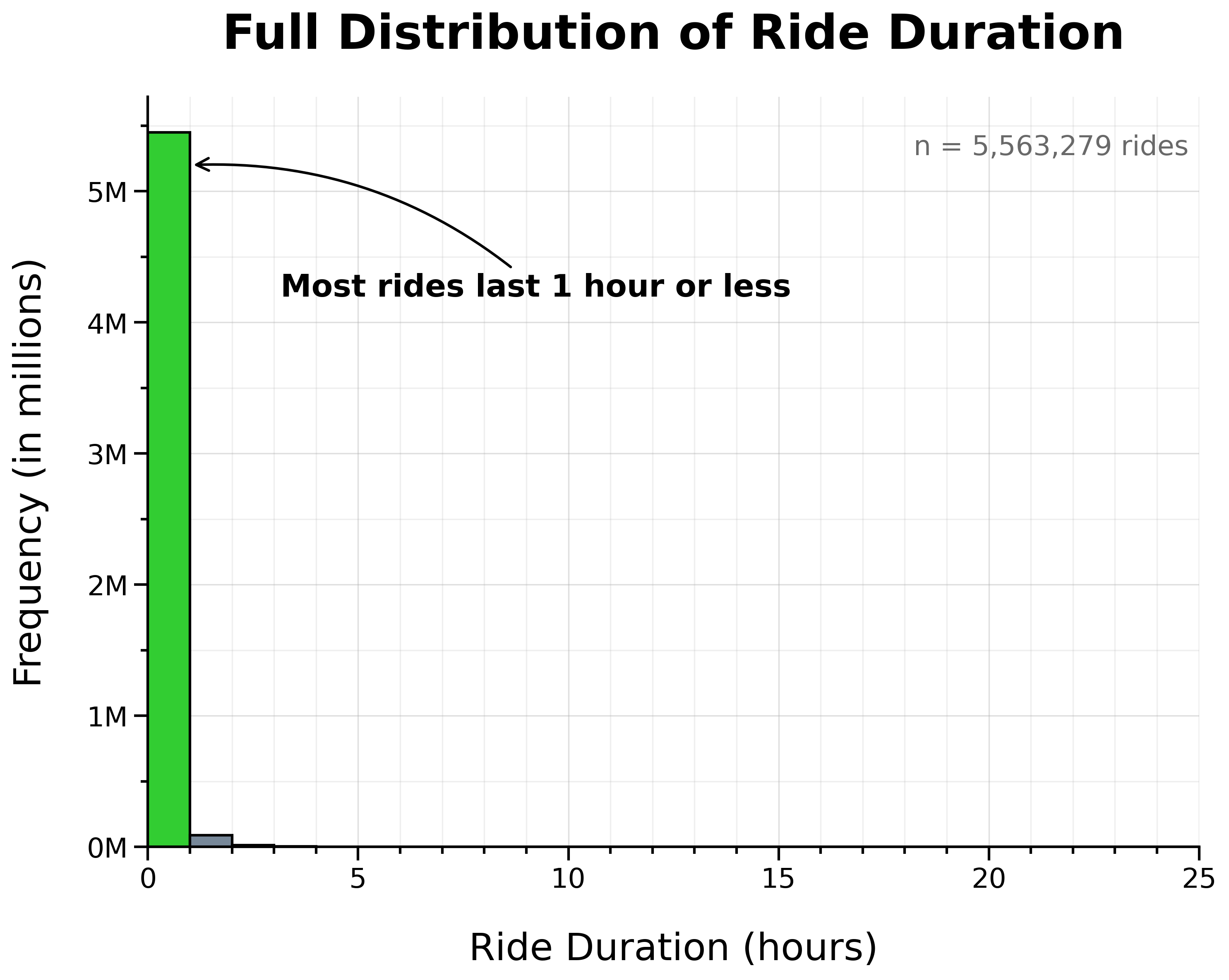
The vast majority of rides lasted 1 hour or less.
However, the distribution showed a long right tail of unusually lengthy rides. To make this tail more apparent, I plotted ride frequency on a logarithmic scale.
Full Distribution of Ride Duration (Log Scale):
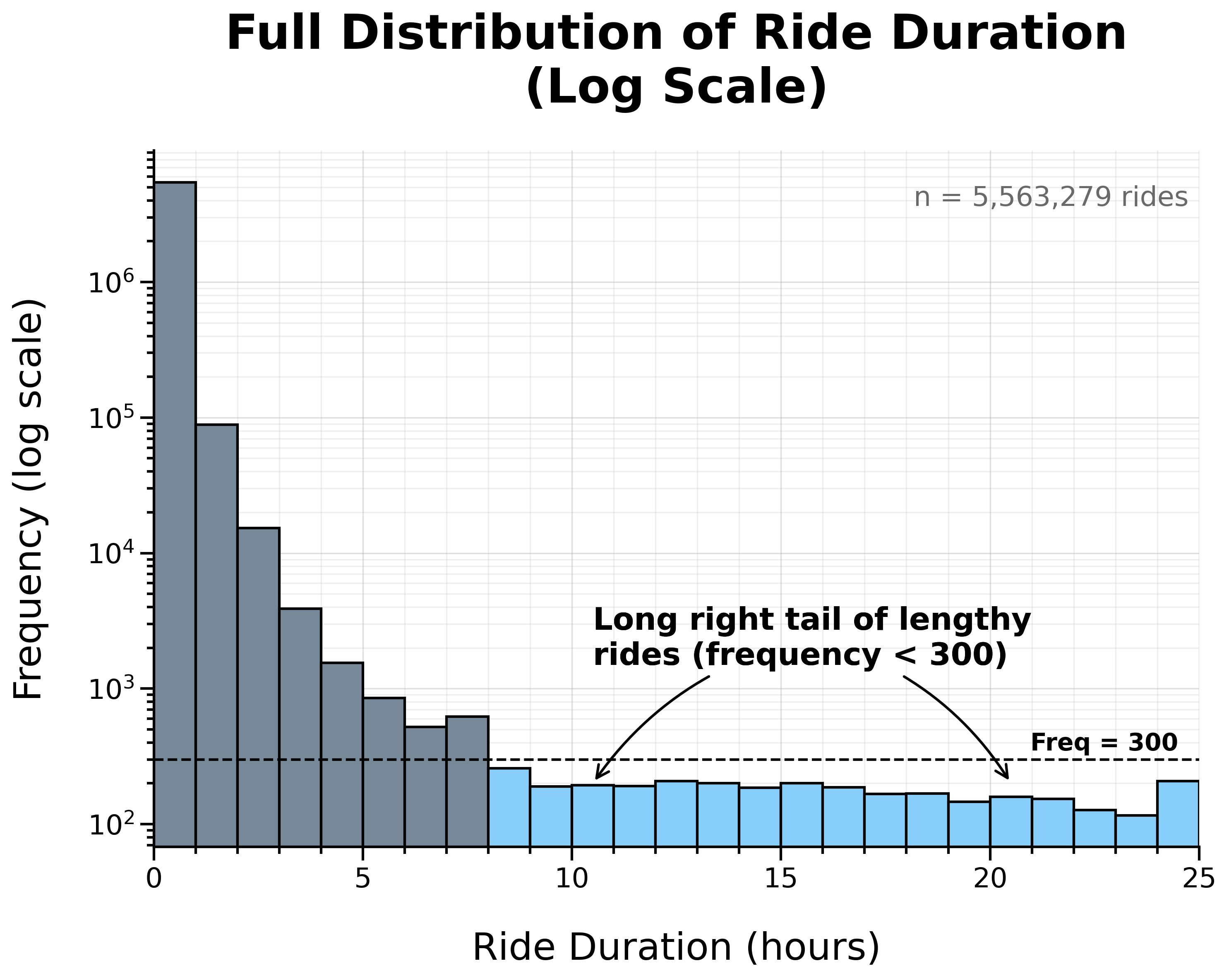
Overall, the distribution is heavily right-skewed, with most rides concentrated at shorter durations.
To take a closer look at this concentration, I zoomed in on rides under 1 hour.
Distribution of Ride Duration Under 1 Hour:
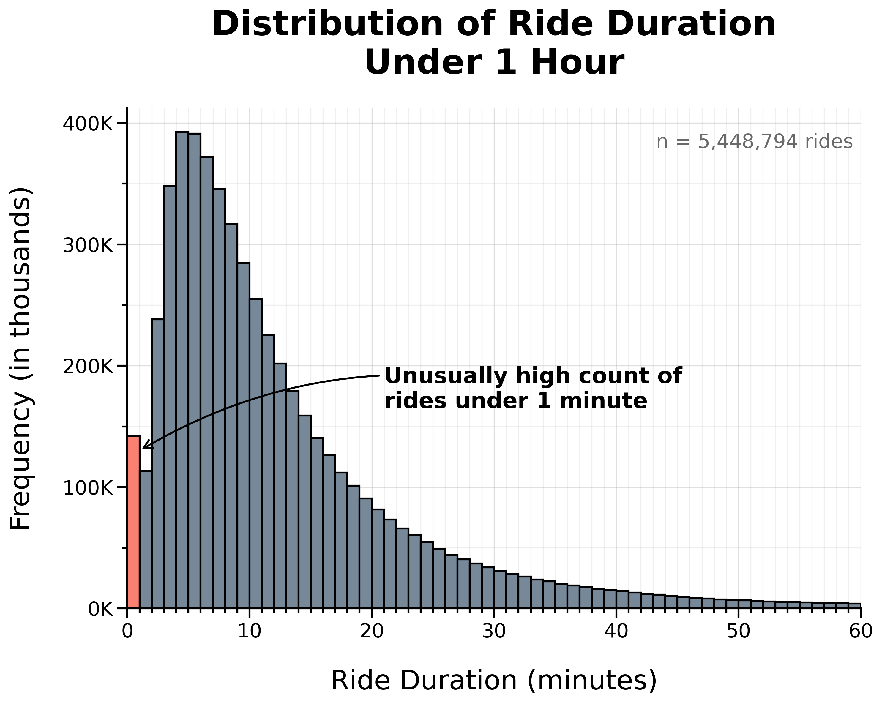
At this scale, there is a noticeable spike in very short rides, with an unusually high count lasting 1 minute or less.
To examine this more closely, I zoomed in further to rides under 5 minutes.
Distribution of Ride Duration Under 5 Minutes:

This revealed an especially high concentration of rides lasting 30 seconds or less.
I suspected that the unusually high frequency of extremely short rides may have been caused by false starts (undocking and quickly re-docking a bike in favor of another) or canceled rides. Extremely long rides, on the other hand, may have been caused by docking errors or forgotten rides.
Since both extremely short and extremely long rides likely do not represent typical rider behavior, I dropped all rides lasting 1 minute or less and all rides lasting 1 day or more.
142,855 rides lasting 1 minute or less and 207 rides lasting 1 day or more were removed for a total of 143,062 rows, representing 2.57% of the original combined dataset.
Cleaning Summary
To review, here is a summary of all the steps so far:
- Loaded and combined data
- Total records: 5,569,279
- Checked for duplicate rows/rides: 0 duplicates
- Dropped
start_station_idandend_station_idcolumns - Converted
started_atandended_atcolumns to datetime - Checked for null values: 2,397,565 nulls
- Dropped rows missing end coordinates: 5,460 (0.10%)
- Filled missing station names with a placeholder (
no_station_recorded) - Dropped rides starting before timeframe: 33 (0.00%)
- Transformed data:
- Extracted start date, month, week, day of week, and hour to new columns
- Calculated ride duration in minutes in a new column
- Dropped rows affected by DST: 507 (0.01%)
- Dropped rides 1 minute or less and rides 1 day or more: 143,062 (2.57%)
In total, 149,062 rows (2.68%) were dropped during cleaning, leaving 5,420,217 rows (over 97%) for analysis.
Export Cleaned Dataset
With the dataset cleaned and validated, I exported and saved it as a CSV file. This way, I’ll have a copy of the cleaned data and won’t have to run the cleaning script every time.
Before exporting, I reset the index to ensure row numbers were continuous after manipulating the data.
df = df.reset_index(drop=True)

df.to_csv(config.CLEAN_PATH, index=False)
Since the dataset is large, I validated the export by re-importing the cleaned CSV and confirming that it matched the dataframe used to create it.
clean_df = pd.read_csv(
    config.CLEAN_PATH, parse_dates=['started_at', 'ended_at']
)

try:
    pd.testing.assert_frame_equal(
        df, clean_df, check_dtype=False, check_exact=False
    )
    print('SUCCESS: Dataframes match.')
    del clean_df
except AssertionError as e:
    print('WARNING: Dataframes do not match:')
    print(e)
The datasets matched, confirming that the cleaned dataset exported successfully.
Data Analysis
The dataset is now cleaned and ready to be used to analyze how annual members and casual riders use bikes differently.
Summary Tables
The first step of the analysis was to create summary tables for each statistic.
To start, I created summary tables to calculate the total counts and proportion of rides by membership for the following:
- Overall—the entire 12-month period (2024-11-01 to 2025-10-31)
- Month—per month
- Week—per week
- Weekday—per day of week (Sunday–Saturday)
- Weekend—weekday vs weekend
- Hour—per hour of day
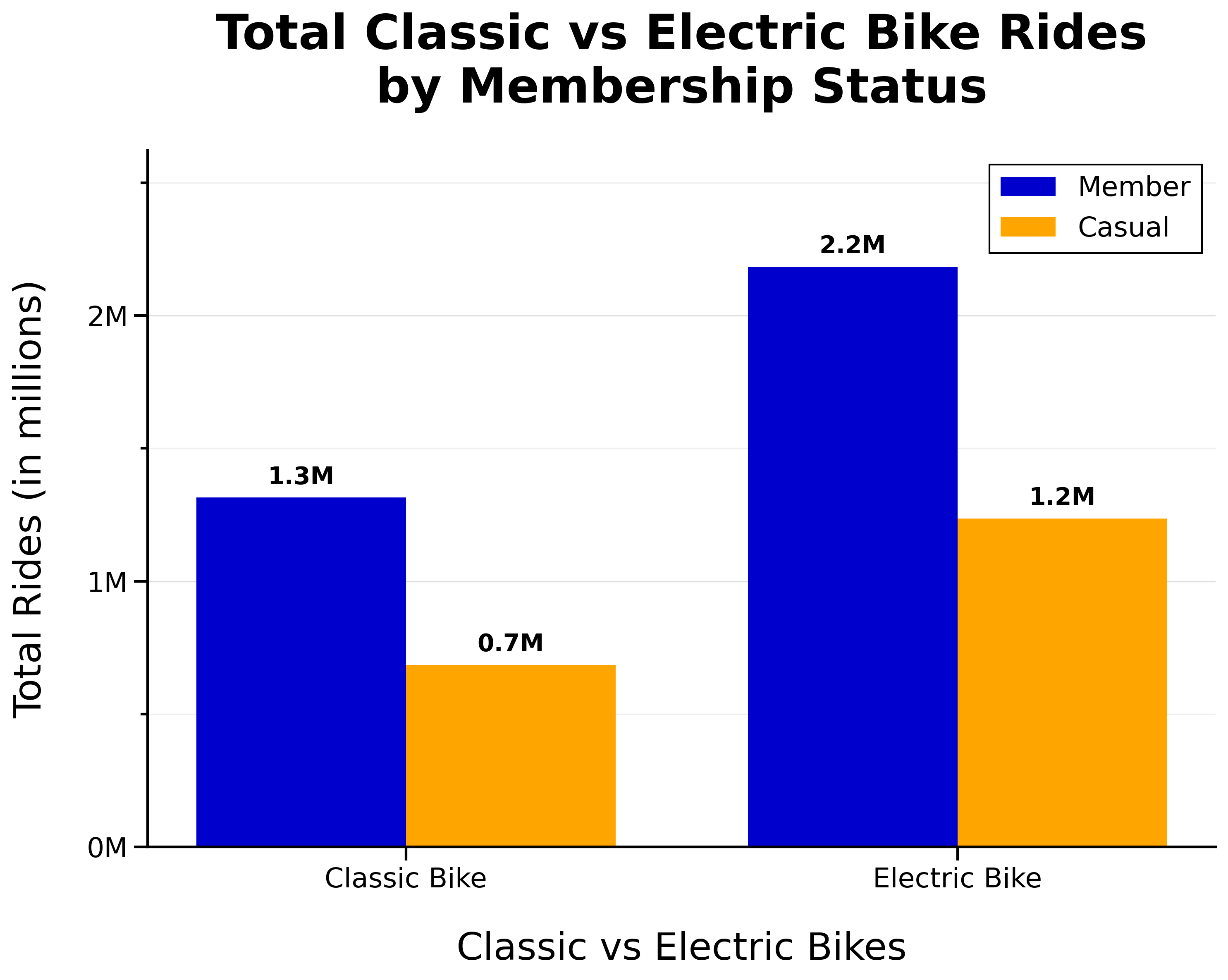
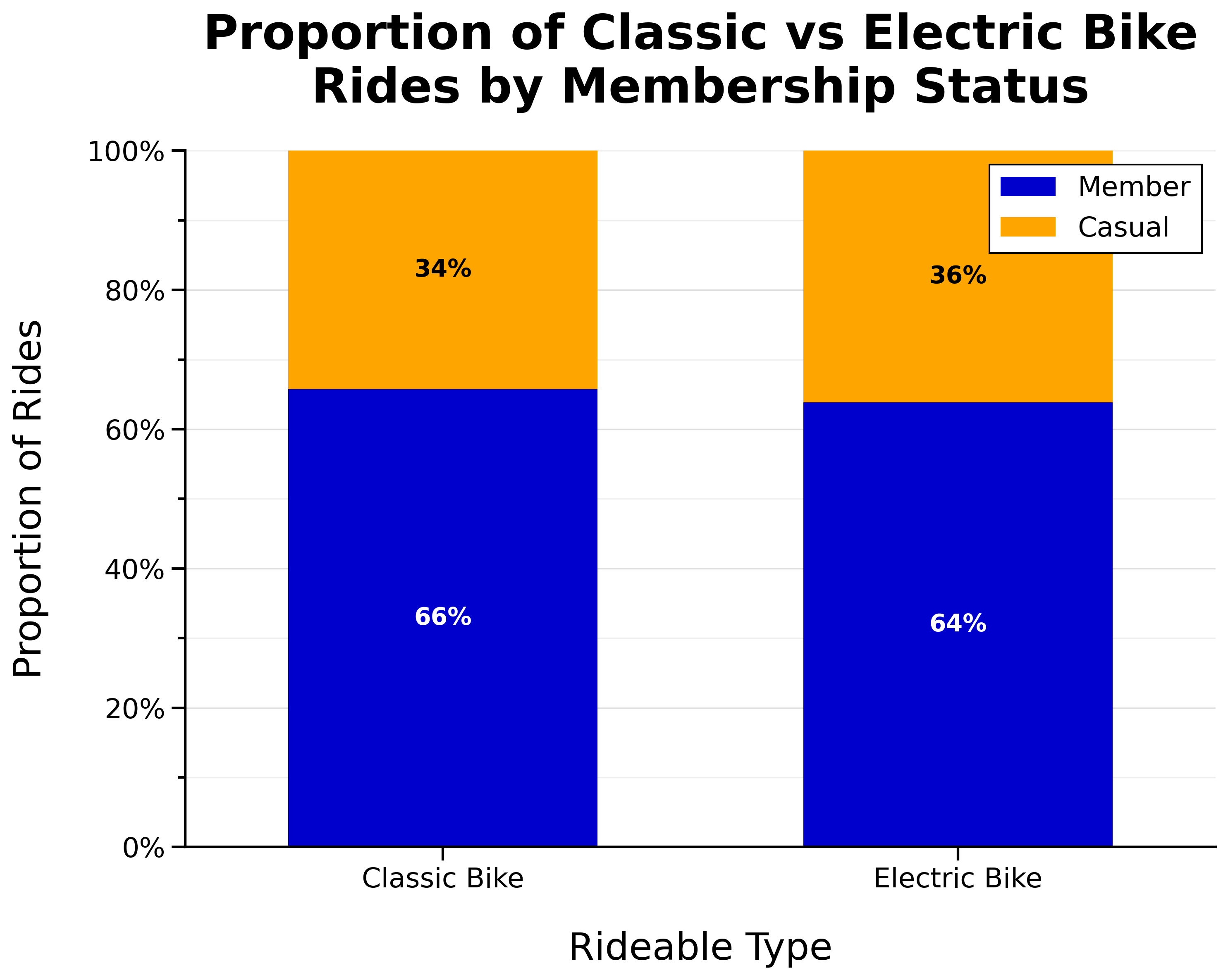
- Bike type—by bike type (‘classic’ or ‘electric’)
- Round-trip—one-way vs round-trip
sum_overall = get_counts_and_pct(df, ['member_casual'])

sum_month = get_counts_and_pct(
    df, ['start_month', 'member_casual']
)

sum_week = get_counts_and_pct(
    df, ['start_week', 'member_casual']
)

sum_weekday = get_counts_and_pct(
    df, ['start_weekday', 'member_casual']
)

sum_weekend = get_counts_and_pct(
    df.assign(
        day_type=np.where(
            df['start_weekday'].isin([0, 6]), 'Weekend', 'Weekday'
            )
    ),
    ['day_type', 'member_casual']
)

sum_hour = get_counts_and_pct(
    df, ['start_hour', 'member_casual']
)

sum_biketype = get_counts_and_pct(
    df, ['rideable_type', 'member_casual']
)

sum_roundtrip = get_counts_and_pct(
    df.assign(
        is_roundtrip=df['start_station_name'] == df['end_station_name']
    ),
    ['is_roundtrip', 'member_casual']
)
In order to visualize the percent change per month by membership, I calculated this in a new column in the monthly counts and percentages summary table (sum_month).
sum_month['pct_change'] = (
    sum_month
    .groupby('member_casual')['count']
    .pct_change() * 100
)
Next, I calculated ride duration statistics (min, max, mean, median, mode, Q1, Q3, IQR) by membership status for the following:
- Overall—the entire 12-month period (2024-11-01 to 2025-10-31)
- Month—per month
- Weekday—per day of week (Sunday–Saturday)
- Bike type—by bike type (‘classic’ or ‘electric’)
stats_aggs = {
    'min': 'min',
    'max': 'max',
    'mean': 'mean',
    'median': 'median',
    'mode': lambda x: x.mode().iloc[0] if not x.mode().empty else np.nan,
    'q1': lambda x: x.quantile(0.25),
    'q3': lambda x: x.quantile(0.75),
    'iqr': lambda x: x.quantile(0.75) - x.quantile(0.25)
}

duration_overall = (
    df.groupby('member_casual')['ride_duration_min']
    .agg(**stats_aggs).reset_index()
)

duration_month = (
    df.groupby(['start_month', 'member_casual'])['ride_duration_min']
    .agg(**stats_aggs).reset_index()
)

duration_weekday = (
    df.groupby(['start_weekday', 'member_casual'])['ride_duration_min']
    .agg(**stats_aggs).reset_index()
)

duration_biketype = (
    df.groupby(['rideable_type', 'member_casual'])['ride_duration_min']
    .agg(**stats_aggs).reset_index()
)
I also found the mode start day of week (most popular day) by membership status:
mode_weekday = (
    df.pivot_table(
        index='member_casual',
        values='start_weekday',
        aggfunc=lambda x: x.mode().iloc[0] if not x.mode().empty else None,
        margins=True,
        margins_name='overall'
    )
    .rename(columns={'start_weekday': 'mode_weekday'})
    .reset_index()
)
Then, I found the top stations, routes (station-to-station pairs), and round-trips (same start and end station) for both members and casual riders.
# Top stations
top_start_m = get_ranking(df, ['start_station_name'], 'member')
top_start_c = get_ranking(df, ['start_station_name'], 'casual')

top_end_m = get_ranking(df, ['end_station_name'], 'member')
top_end_c = get_ranking(df, ['end_station_name'], 'casual')

# Top routes
top_routes_m = get_ranking(
    df, ['start_station_name', 'end_station_name'], 'member'
)
top_routes_c = get_ranking(
    df, ['start_station_name', 'end_station_name'], 'casual'
)

# Top round-trips
is_roundtrip = df['start_station_name'] == df['end_station_name']

top_roundtrips_m = get_ranking(
    df[is_roundtrip], ['start_station_name'], 'member'
)
top_roundtrips_c = get_ranking(
    df[is_roundtrip], ['start_station_name'], 'casual'
)
Finally, I calculated the ride density by membership for each hour of each day of the week (Sunday–Saturday) to create the heat maps.
density_day_hour_m = get_ranking(
    df, ['start_weekday', 'start_hour'], 'member'
)

density_day_hour_c = get_ranking(
    df, ['start_weekday', 'start_hour'], 'casual'
)
Pivot Tables
To prepare the data for plotting, I created pivot tables from the summary tables created in the previous section.
pivot_monthly_counts = sum_month.pivot(
    index='start_month',
    columns='member_casual',
    values='count'
)

pivot_weekly_counts = (
    sum_week
        .pivot(index='start_week', columns='member_casual', values='count')
        .fillna(0)
        .sort_index()
)

pivot_monthly_pct_change = (
    sum_month
    .pivot(
        index='start_month',
        columns='member_casual',
        values='pct_change'
    )
    .sort_index()
)

pivot_weekday_counts = sum_weekday.pivot(
    index='start_weekday',
    columns='member_casual',
    values='count'
)

pivot_weekday_prop = (
    sum_weekday
    .pivot(index='start_weekday', columns='member_casual', values='percentage')
    .reindex(range(7), fill_value=0)
    .sort_index()
)

pivot_weekend_counts = (
    sum_weekend
    .pivot(index='day_type', columns='member_casual', values='count')
    .reindex(['Weekday', 'Weekend'])
)

pivot_weekend_prop = (
    sum_weekend
    .pivot(index='day_type', columns='member_casual', values='percentage')
    .reindex(['Weekday', 'Weekend'])
)

pivot_hour_counts = (
    sum_hour
        .pivot(index='start_hour', columns='member_casual', values='count')
        .fillna(0)
        .sort_index()
)

pivot_density_day_hour_m = (
    density_day_hour_m
        .pivot(index='start_weekday', columns='start_hour', values='count')
        .reindex(index=range(7), columns=range(24), fill_value=0)
)

pivot_density_day_hour_c = (
    density_day_hour_c
        .pivot(index='start_weekday', columns='start_hour', values='count')
        .reindex(index=range(7), columns=range(24), fill_value=0)
)

pivot_density_day_hour_m = pivot_density_day_hour_m.div(
    pivot_density_day_hour_m.sum(axis=1), axis=0
)
pivot_density_day_hour_c = pivot_density_day_hour_c.div(
    pivot_density_day_hour_c.sum(axis=1), axis=0
)

pivot_duration_weekday = duration_weekday.pivot(
    index='start_weekday',
    columns='member_casual',
    values='median'
)

pivot_roundtrip_counts = sum_roundtrip.pivot(
    index='is_roundtrip',
    columns='member_casual',
    values='count'
)

pivot_roundtrip_prop = (
    sum_roundtrip
    .pivot(index='is_roundtrip', columns='member_casual', values='percentage')
    .reindex([0, 1])
)

pivot_biketype_counts = sum_biketype.pivot(
    index='rideable_type',
    columns='member_casual',
    values='count'
)

pivot_biketype_prop = (
    sum_biketype
    .pivot(index='rideable_type', columns='member_casual', values='percentage')
)
Note: No pivot table was needed for sum_overall since the data was ready to be plotted as-is.
In addition, I prepared the data for the box plot showing ride duration distribution by membership status.
dist_duration_overall = (
    df[['ride_duration_min', 'member_casual']]
    .assign(membership_group=lambda d: d['member_casual'].map({
        'member': 'Member',
        'casual': 'Casual'
    }))
    [['ride_duration_min', 'membership_group']]
)

median_values = (
    dist_duration_overall
    .groupby('membership_group')['ride_duration_min']
    .median()
)
Data Visualization
Using the summary and pivot tables created earlier, I created visualizations to show how annual members and casual riders use bikes differently.
Below, I’ve included one representative example—the first bar chart showing “Total Rides by Membership Status”—which demonstrates the simplest implementation. For the complete visualization code, including more complex graphics, see the _2_analysis_and_viz script in my GitHub repository.
#%% fig_1 Total rides by membership status

fig, ax = plt.subplots(figsize=(10, 8))
WIDTH = 0.6

bars_member = ax.bar(
    ['Member'],
    sum_overall.loc[
        sum_overall['member_casual'] == 'member', 'count'
    ],
    width=WIDTH,
    label='Member',
    zorder=2
)
bars_casual = ax.bar(
    ['Casual'],
    sum_overall.loc[
        sum_overall['member_casual'] == 'casual', 'count'
    ],
    width=WIDTH,
    label='Casual',
    zorder=2
)

ax.set_title('Total Rides by Membership Status')
ax.set_xlabel('Membership Status')
ax.set_ylabel('Total Rides (in millions)')

ymax = sum_overall['count'].max() * 1.2
ax.set_ylim(0, ymax)
ax.set_yticks(np.arange(0, ymax, 1_000_000))
ax.set_yticks(np.arange(0, ymax, 500_000), minor=True)
ax.yaxis.set_major_formatter(
    FuncFormatter(lambda x, pos: f'{x/1_000_000:.0f}M')
)

ax.grid(False, axis='x')
ax.grid(which='minor', axis='y', linestyle='-', alpha=0.2, zorder=0)

# Annotation: Bar counts and percentages
for bars, category in [(bars_member, 'member'), (bars_casual, 'casual')]:
    row = sum_overall.loc[
        sum_overall['member_casual'] == category
    ].iloc[0]
    ax.bar_label(
        bars,
        labels=[f'{row["count"]:,.0f}\n({row["percentage"]:.1f}%)'],
        padding=8,
        fontsize=16,
        fontweight='bold',
        color='black'
    )

# Annotation: Sample size
ax.text(
    0.99, 0.95,
    f'n = {sum_overall["count"].sum():,} rides',
    transform=ax.transAxes,
    ha='right', va='top',
    fontsize=16, color='dimgray'
)

plt.savefig(
    viz_png / 'fig_1_Total_rides.png',
    bbox_inches="tight",
    dpi=300
)
plt.show()
Key Insights
The visualizations below summarize the key insights on how members and casual riders use bikes differently.
Overall
Total Rides by Membership Status:
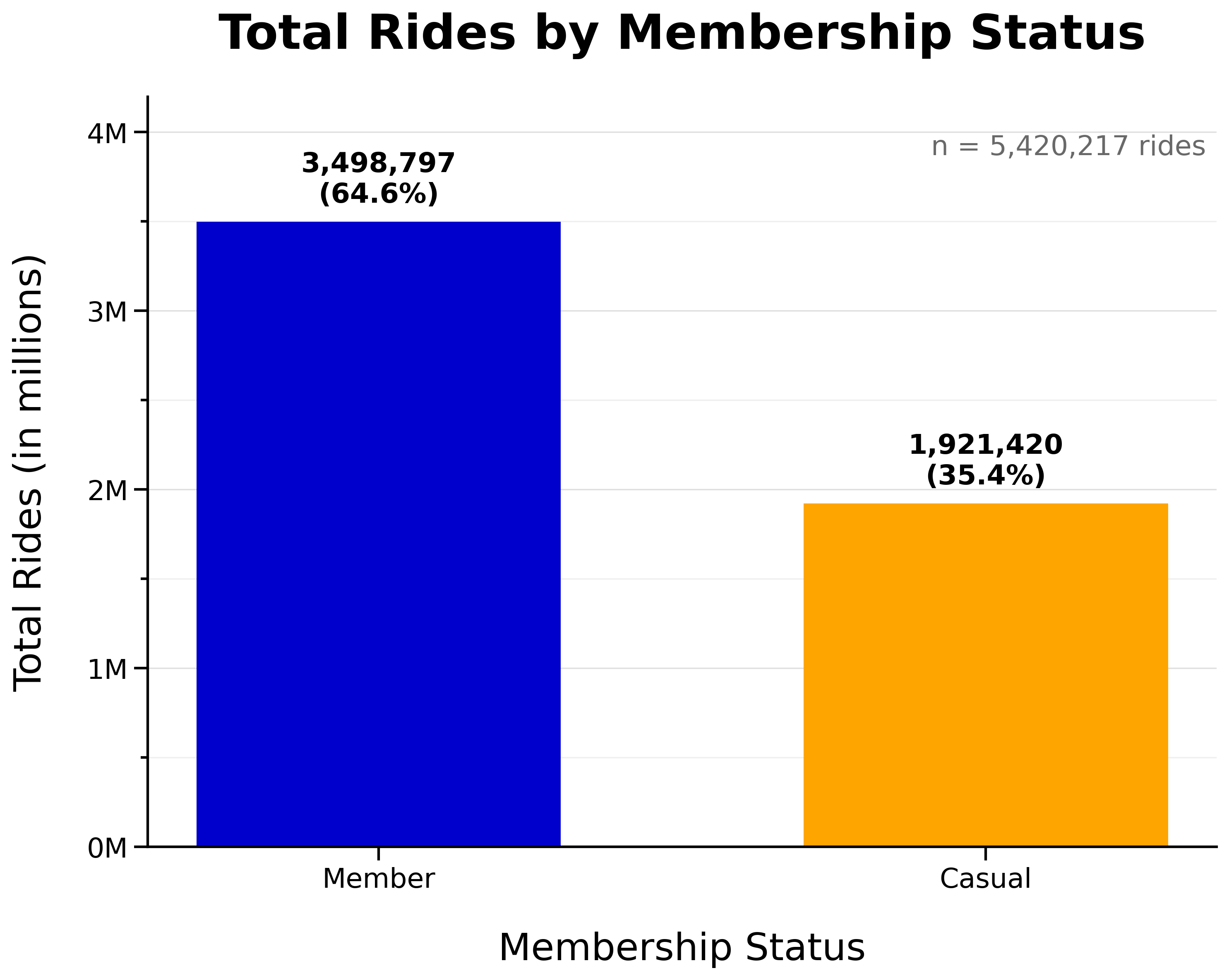
- Annual members make up the majority of rides overall (65%)
- Casual riders still make up a significant portion (35%)
Seasonality
Total Monthly Rides by Membership Status:
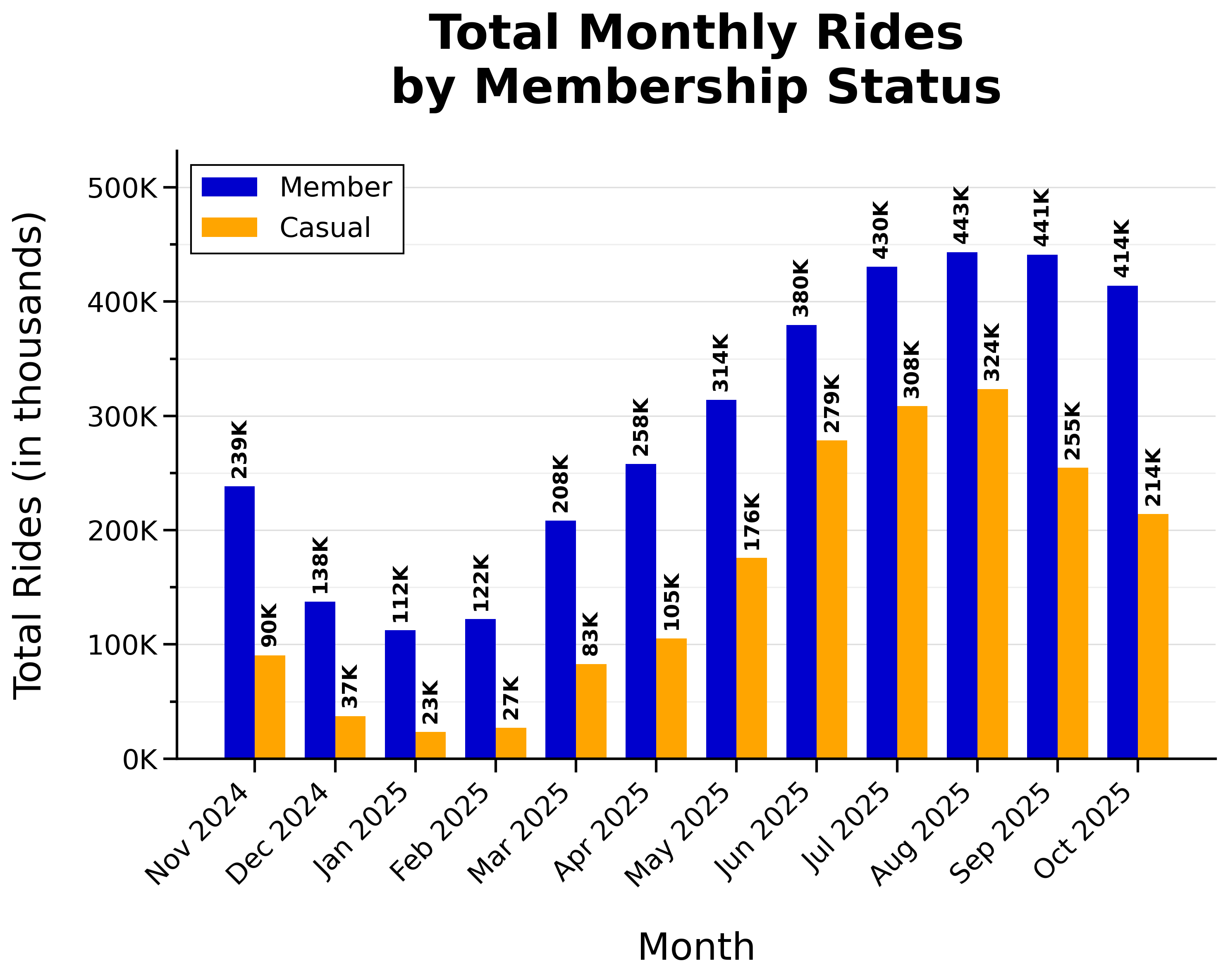
- Rides peaked during warmer months (summer and early fall)
Weekly Proportion of Rides by Membership Status:
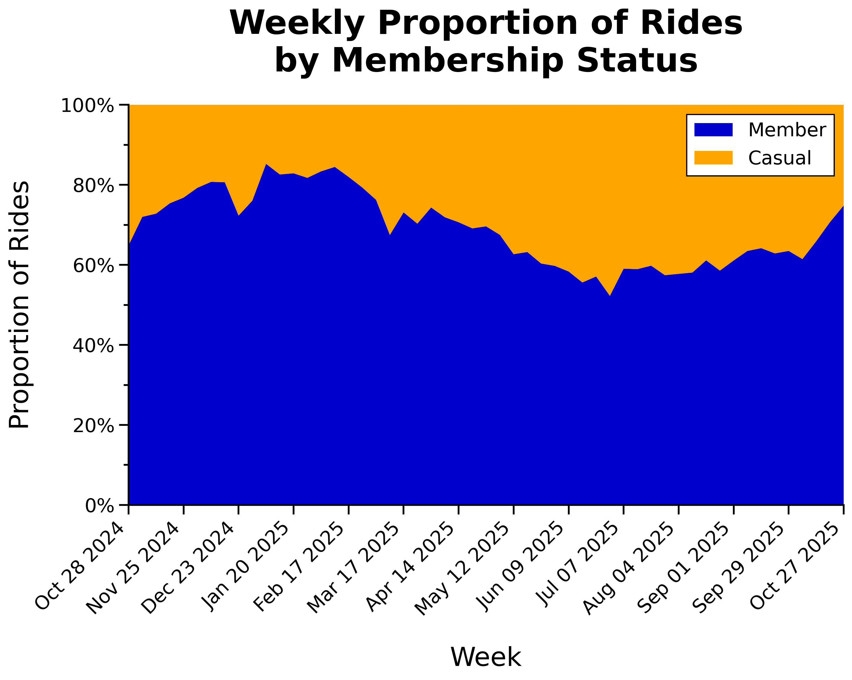
- Proportion of casual riders increases during peak riding season
Monthly Percent Change in Rides by Membership Status:
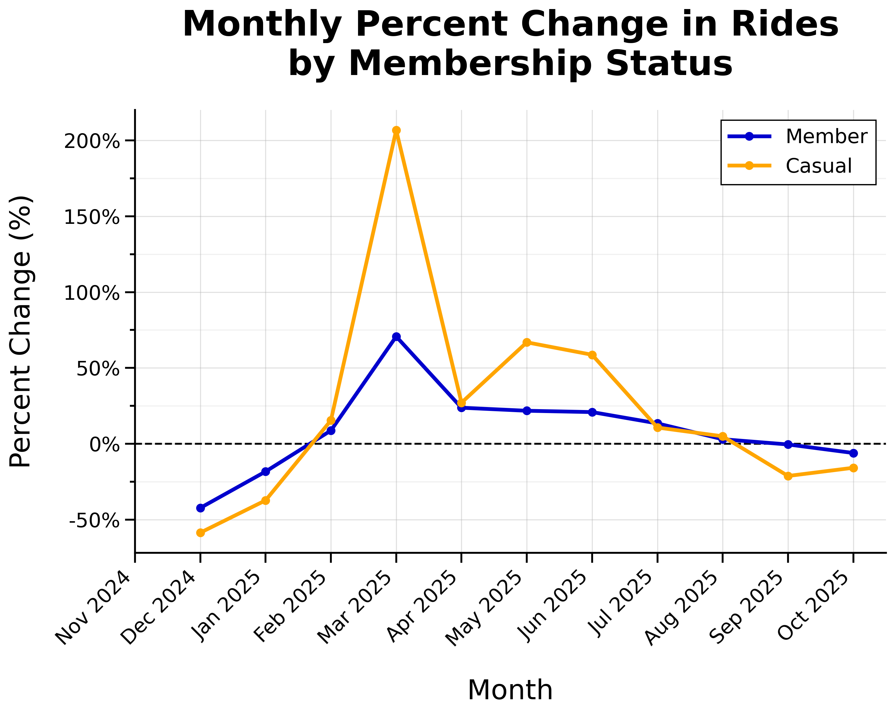
- Overall positive growth from February through August, with most growth during spring
- Huge spike of casual riders in March (+207% from February)
Day of Week
Total Daily Rides by Membership Status:
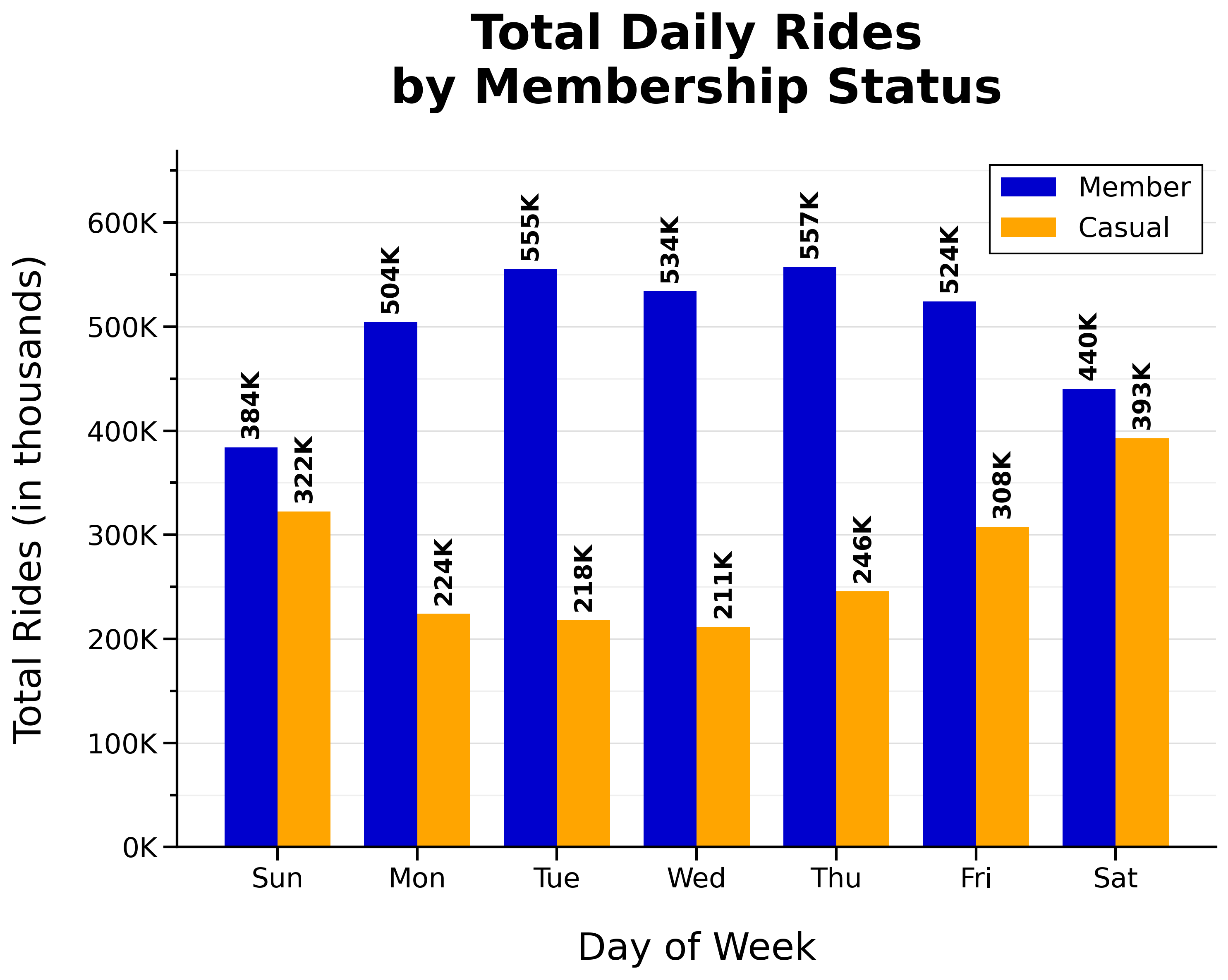
- Total member rides are higher on weekdays (‘n’ shaped)
- The busiest day for members is Thursday
- Total casual rides are higher on weekends (‘u’ shaped)
- The busiest day for casual riders is Saturday
Proportion of Weekday vs Weekend Rides by Membership Status:
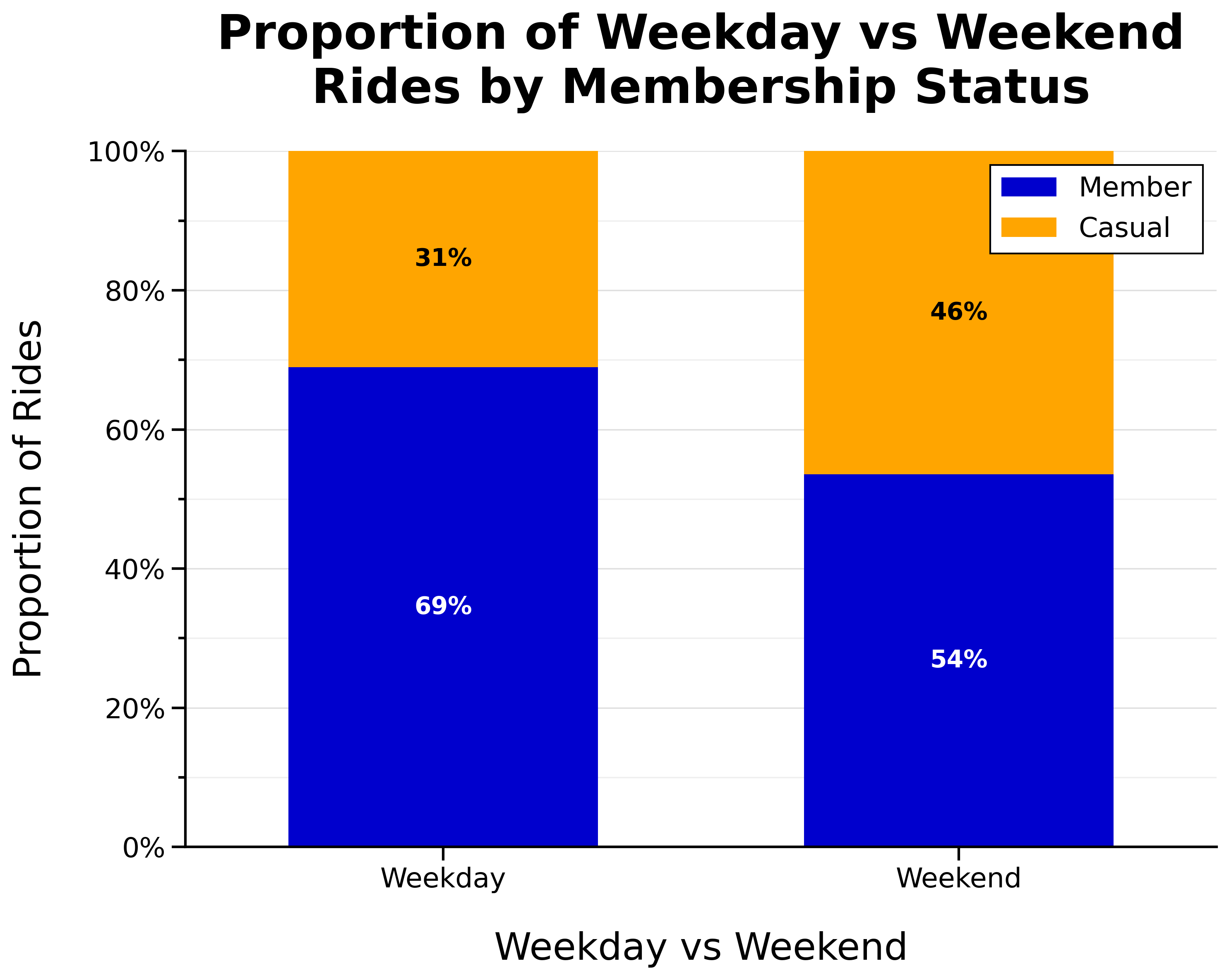
- Proportion of casual riders is higher on weekends
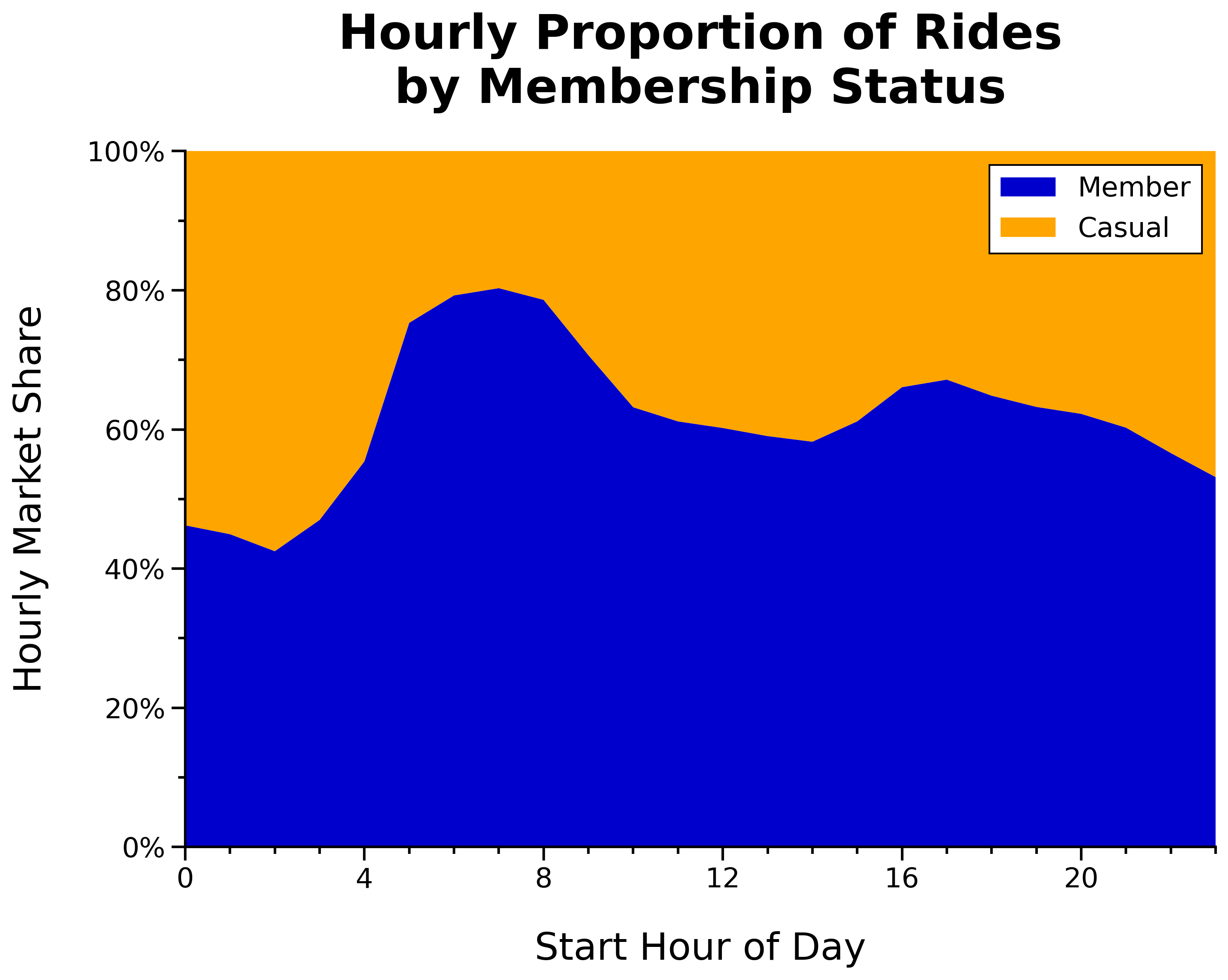
Time of Day
Total Rides per Start Hour by Membership Status:
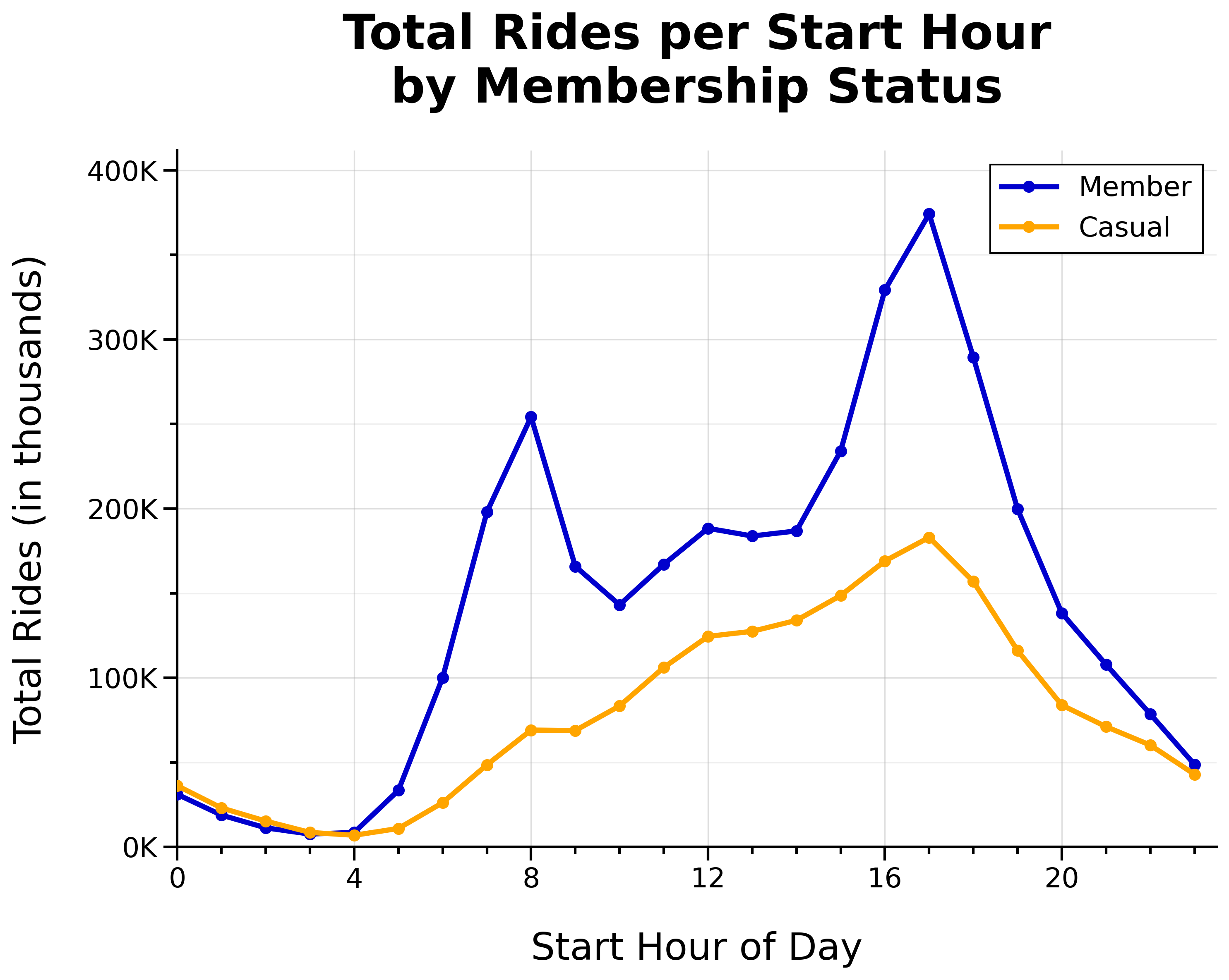
- Two member daily commute spikes at 8 a.m. and 5 p.m.
- Member lunch rush around noon
- Casual rides gradually build throughout the day (until 5 p.m.)
Ride Density per Day and Hour by Membership Status:
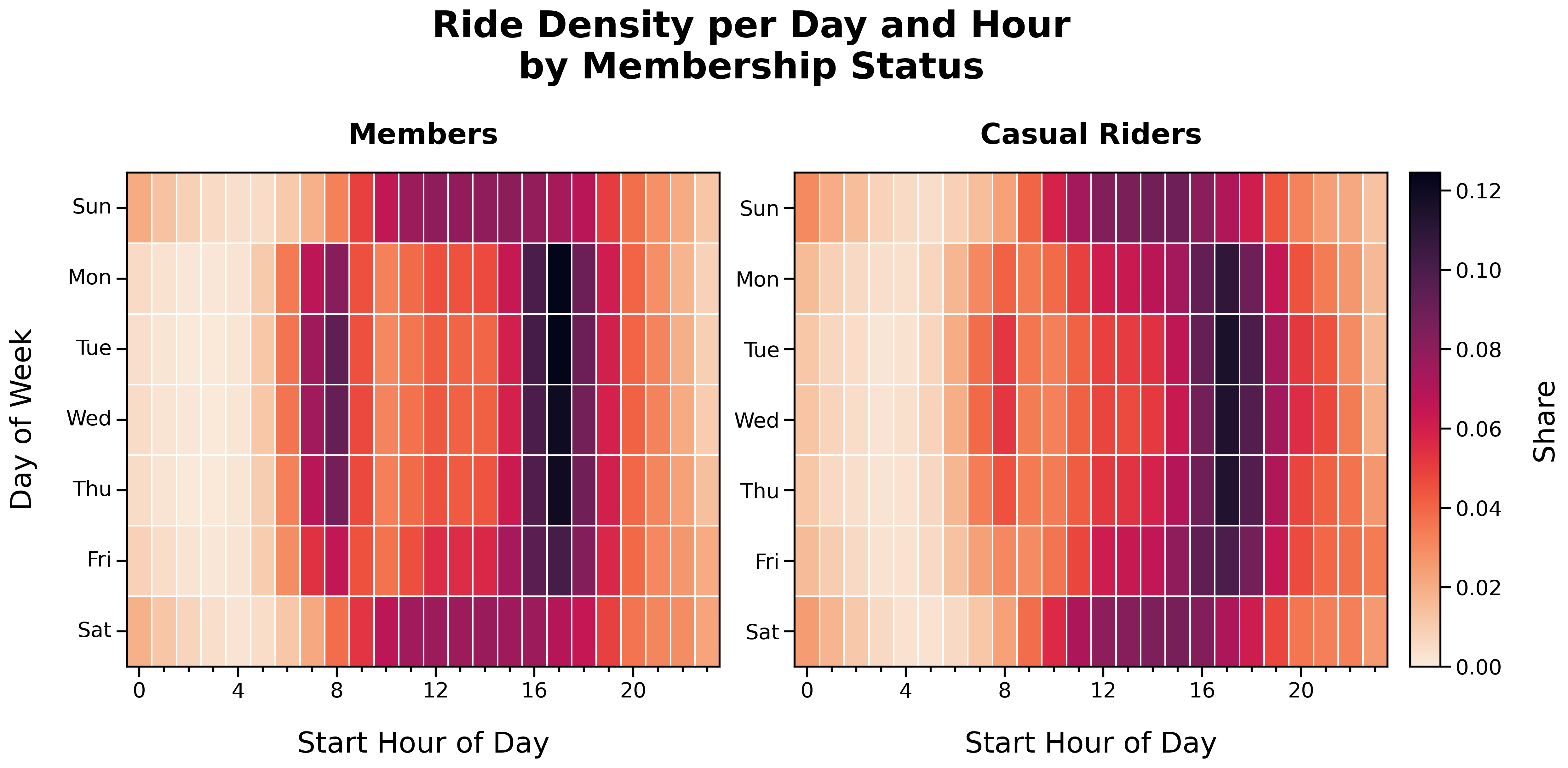
Ride Density per Day and Hour (Members):
- Distinct ‘O’ shape
- Member activity corresponds with weekday commute times and weekend afternoons
Ride Density per Day and Hour (Casual Riders):
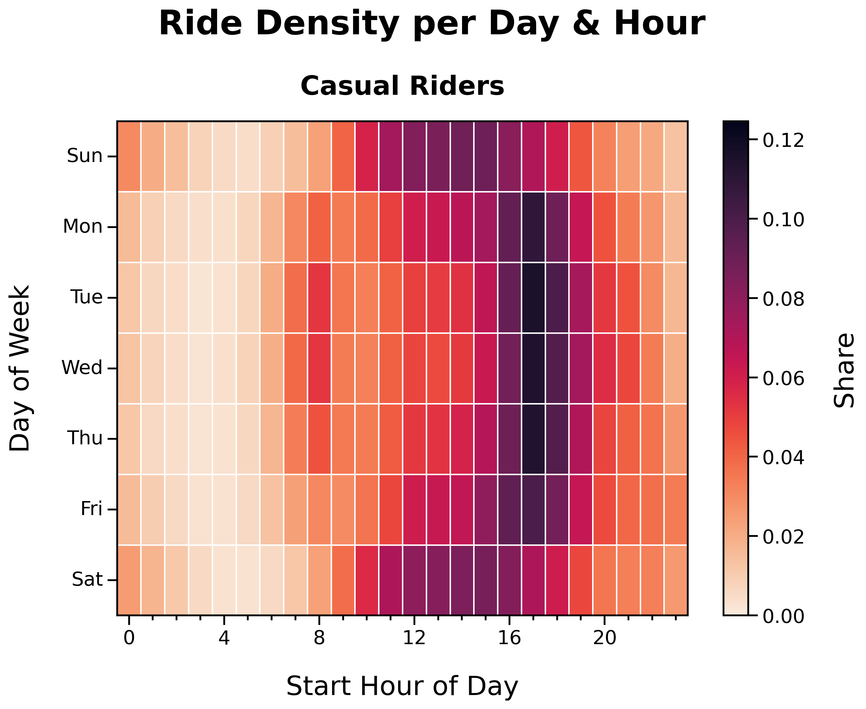
- Faint ‘O’ shape
- Casual rider activity is more dispersed across time and day
Ride Duration
Distribution of Ride Durations by Membership Status:
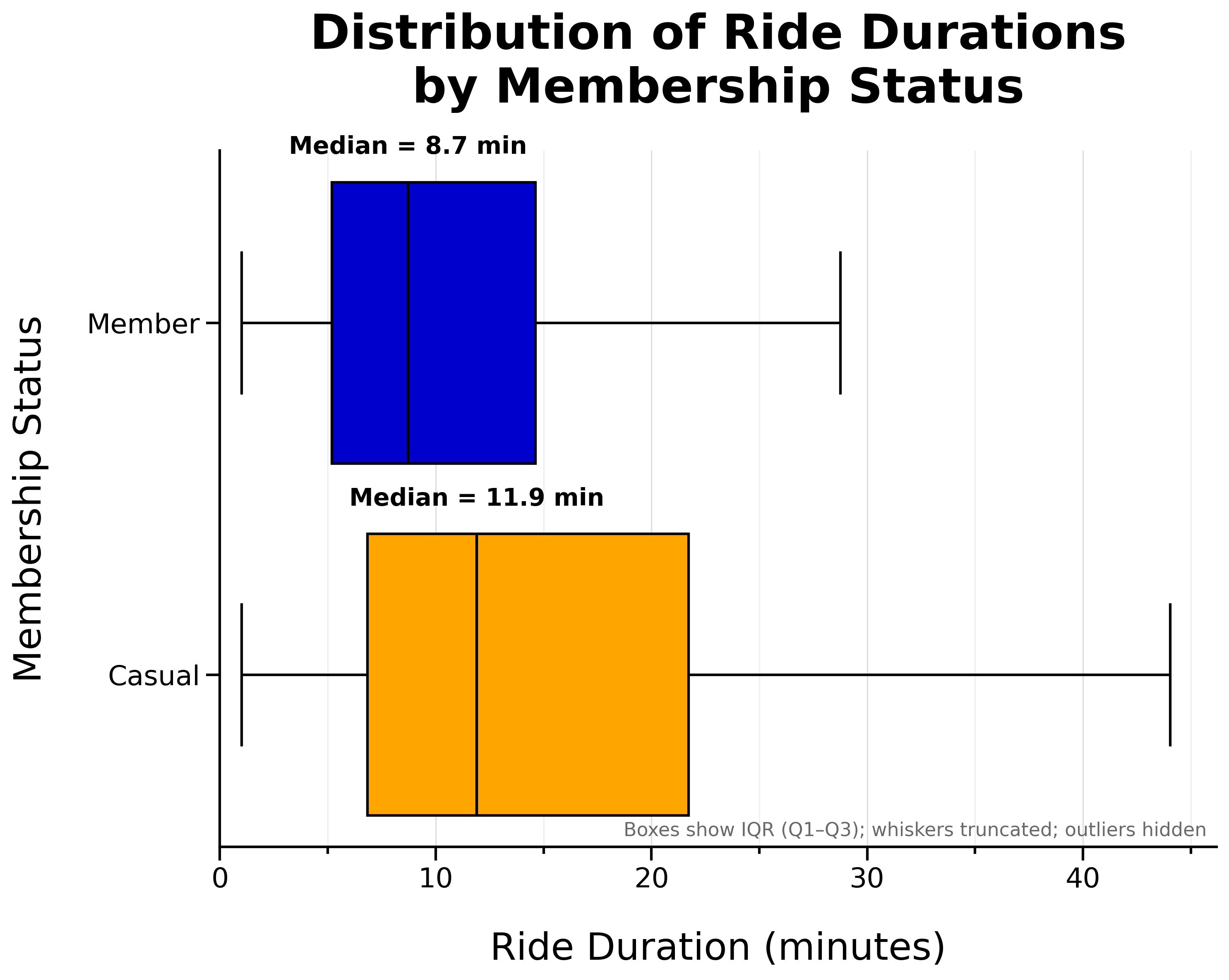
- Casual riders tend to take slightly longer rides
- Member median ride length is 8.7 minutes
- Casual rider median ride length is 11.9 minutes
Median Ride Duration per Weekday by Membership Status:
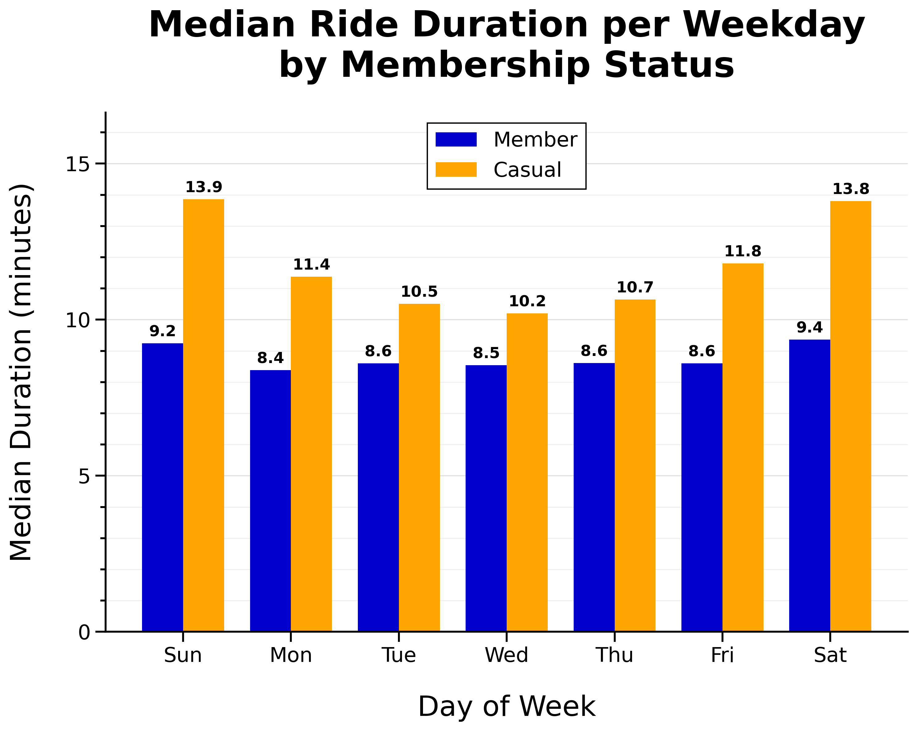
- Member median ride duration is fairly consistent day-to-day
- Casual riders take longer rides on weekends
Location
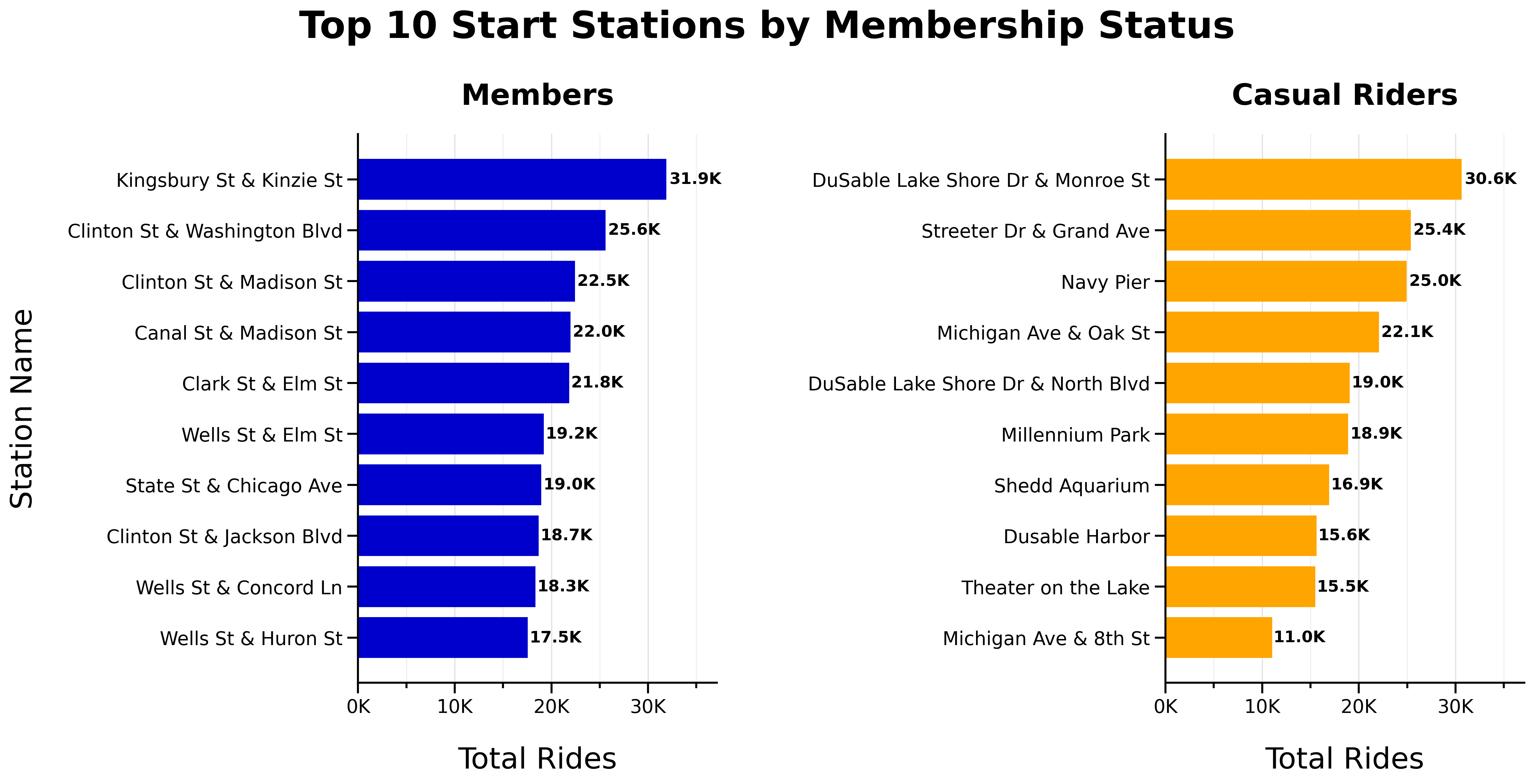
Top 10 Start Stations by Membership Status:
Top 10 End Stations by Membership Status:
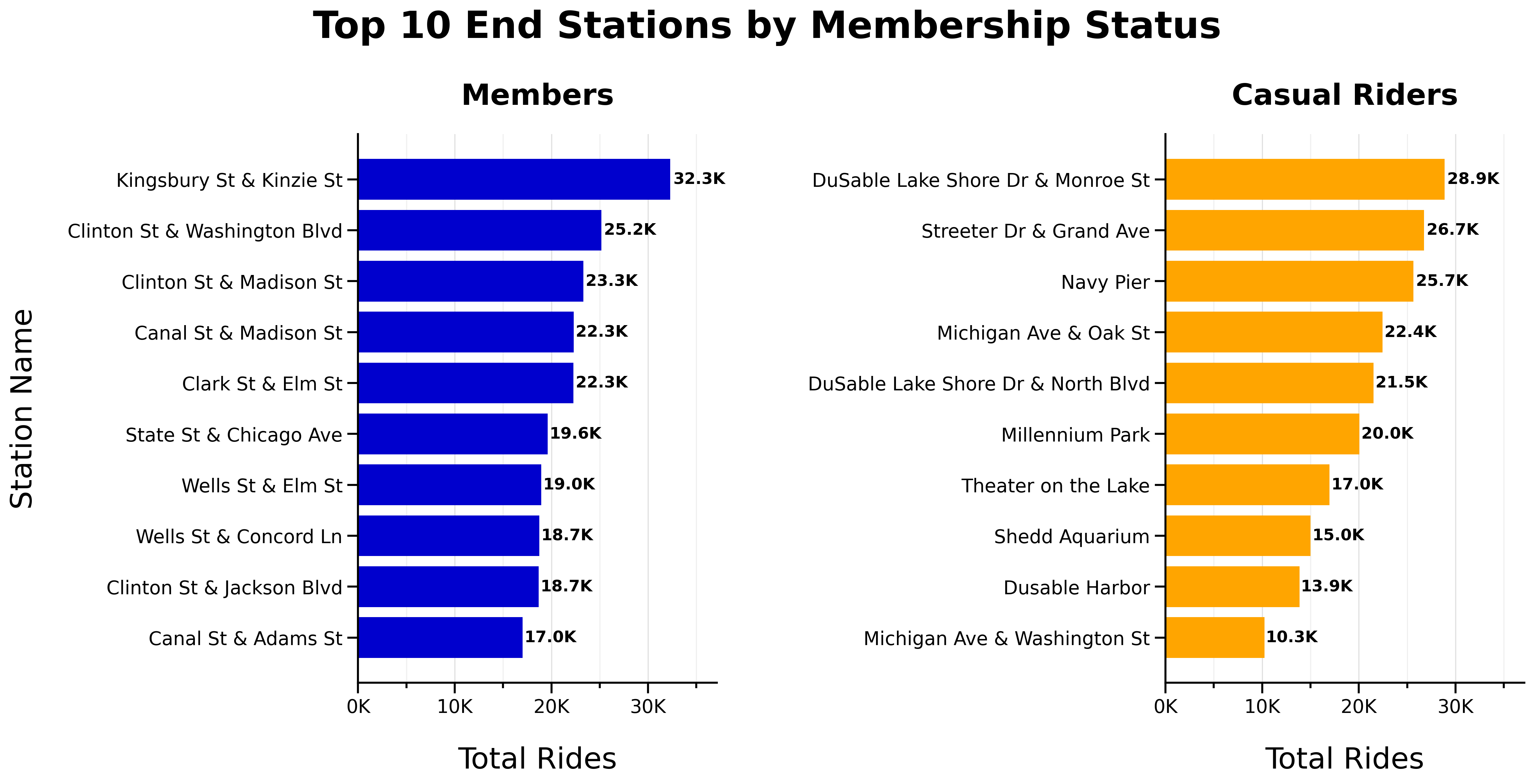
- No overlap between top 10 start or end stations for members and casual riders
- Top start and end stations are consistent
Round Trips
Total One-Way vs Round-Trips by Membership Status:

- Most trips are one-way (different start and end stations)
Proportion of One-Way vs Round-Trips by Membership Status:
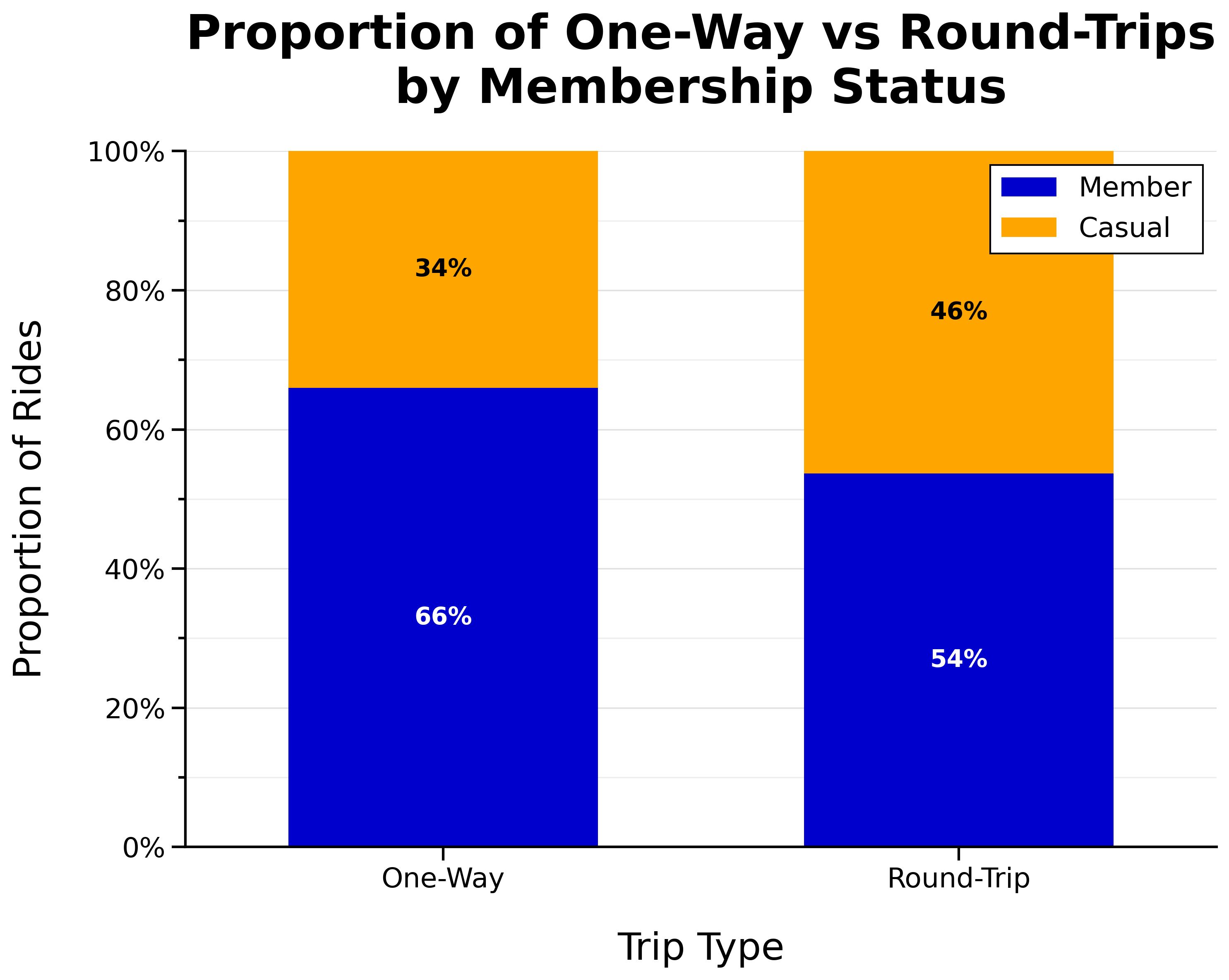
- Larger proportion of casual riders take round trips
Additional Visuals
The following visualizations provide additional context and are included for reference.
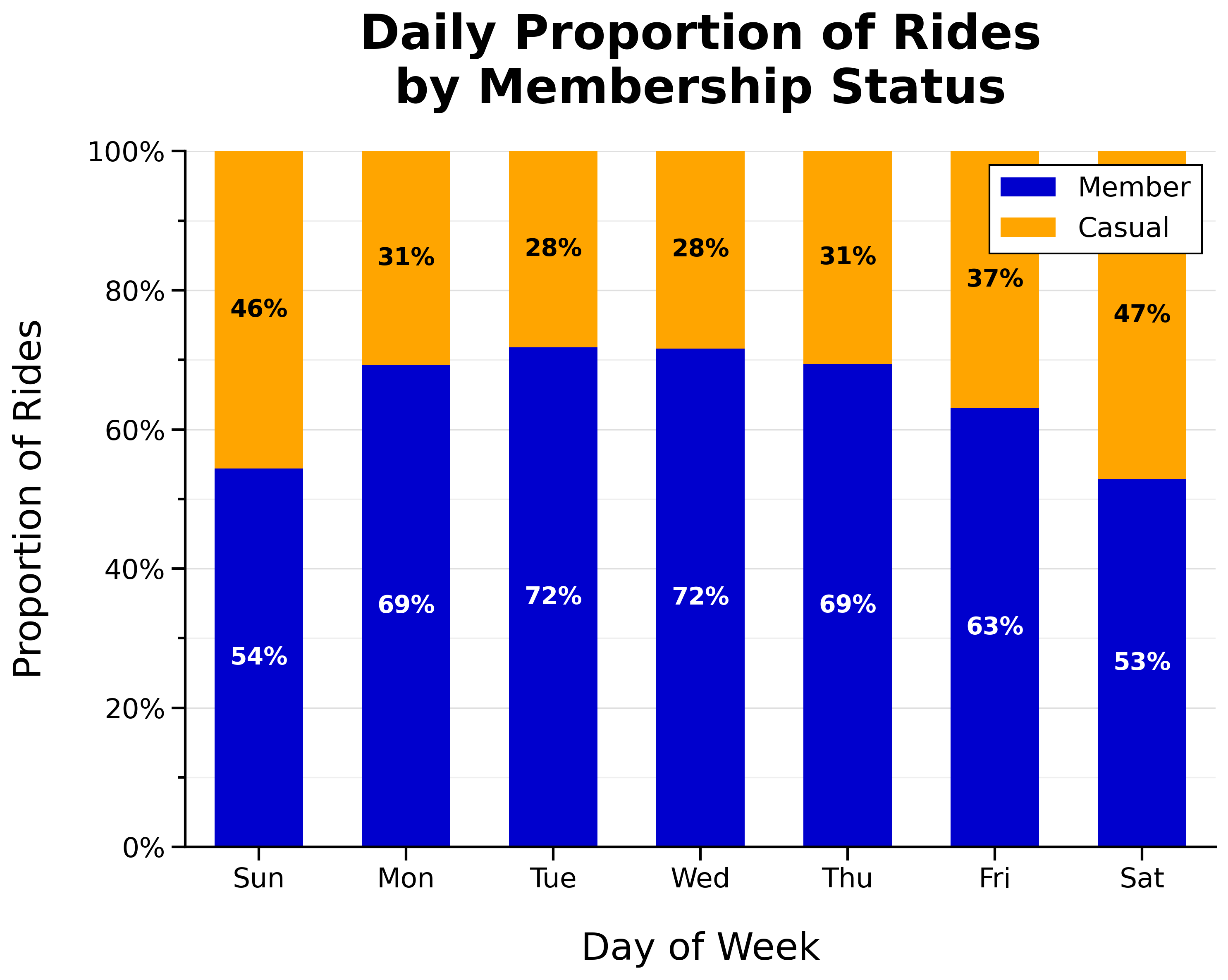
Daily Proportion of Rides by Membership Status:
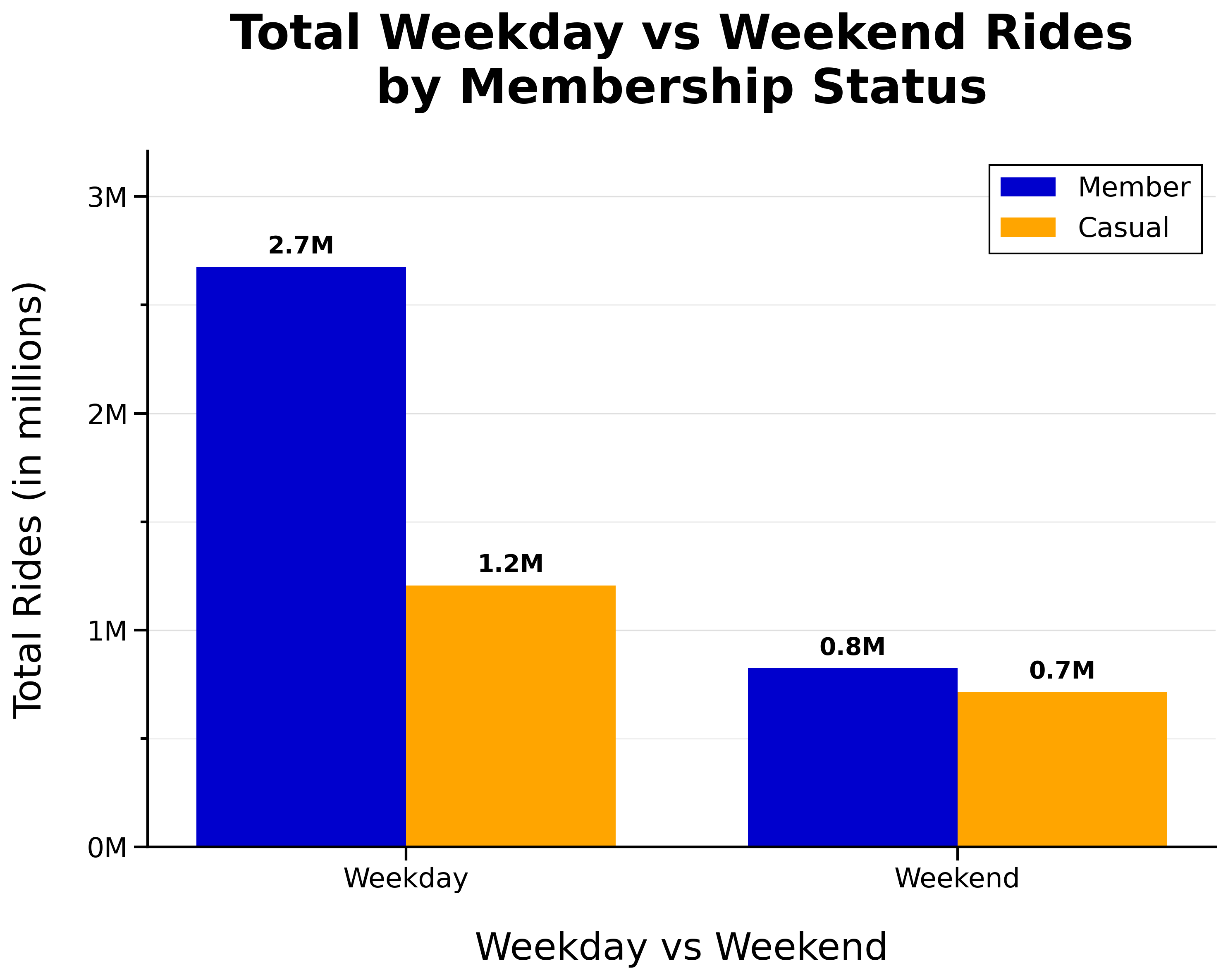
Total Weekday vs Weekend Rides by Membership Status:
Hourly Proportion of Rides by Membership Status:
Total Classic vs Electric Bike Rides by Membership Status:
Proportion of Classic vs Electric Bike Rides by Membership Status:
Location Map
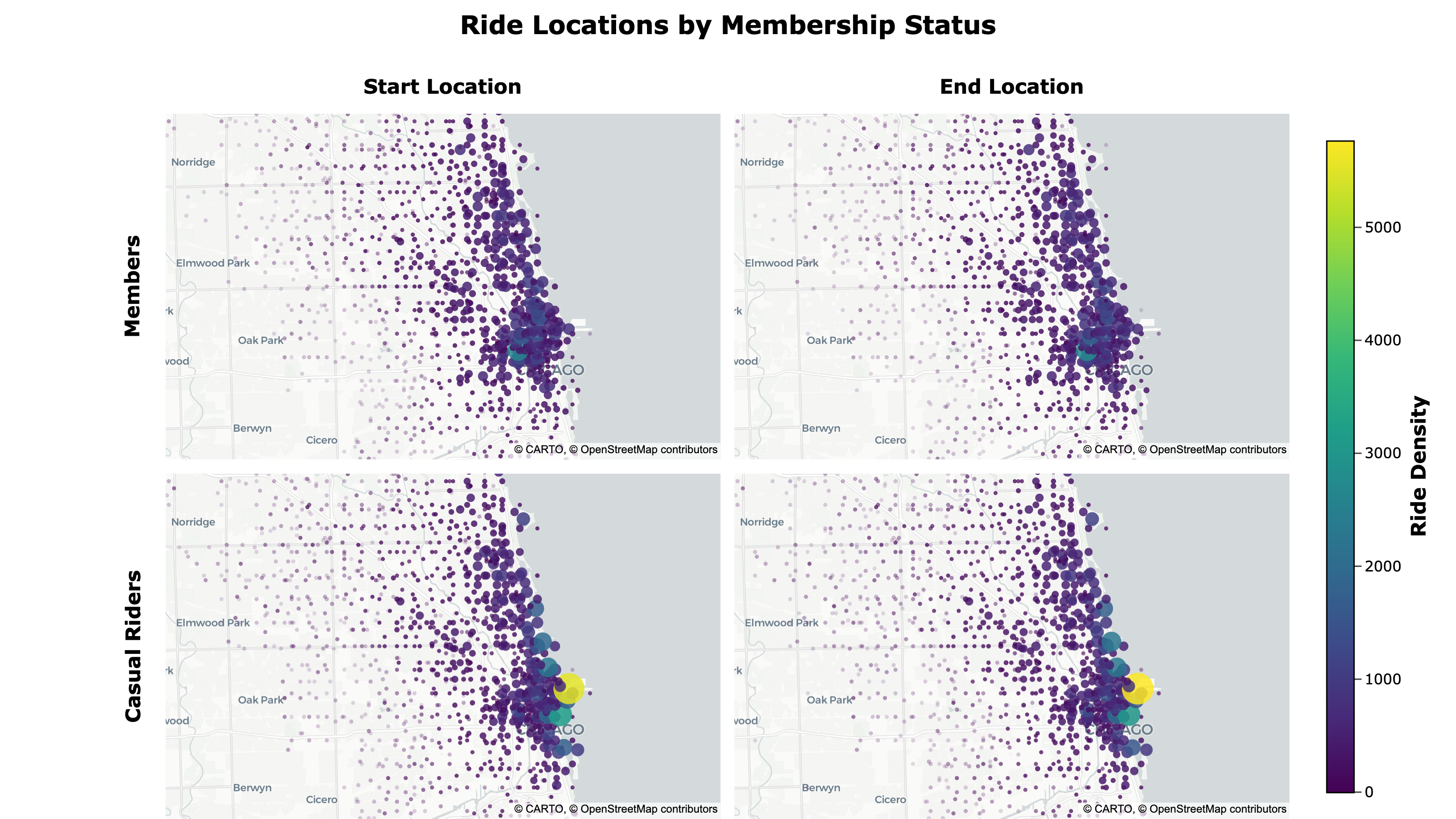
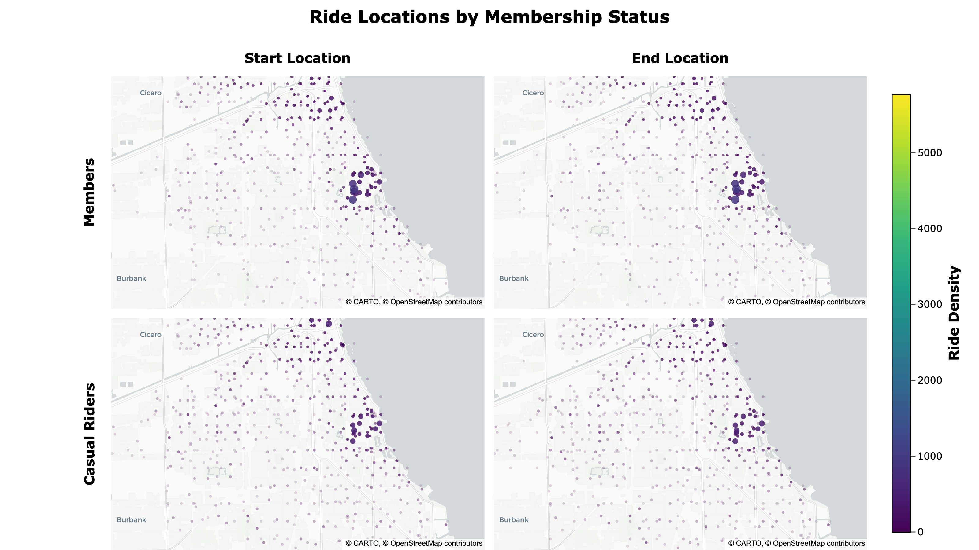
To better compare geographic differences, I created a dynamic, density-weighted point map showing ride start and end locations by membership type using Plotly. I exported it to HTML with custom JavaScript that links the pan and zoom of the maps and adds responsive scaling for different screen sizes.
Ride Locations by Membership Status:
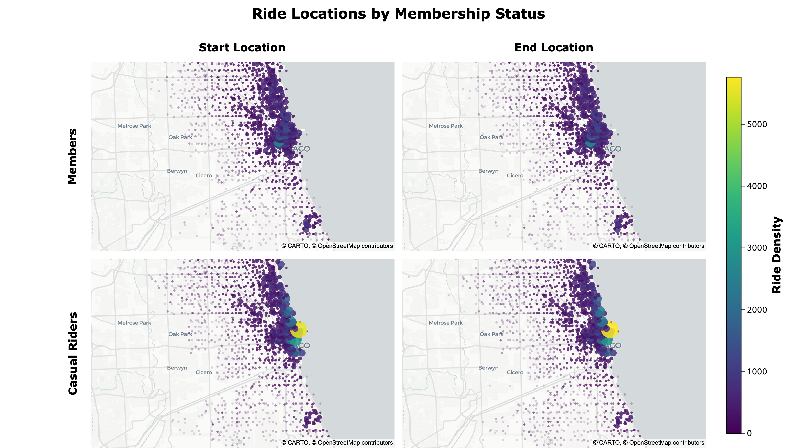
- Member ride locations are more dispersed, while casual riders tend to cluster near the lakeshore
The map can be accessed here.
Because the map is interactive, you can pan and zoom around to view specific areas.
Key Recommendations
The results of this analysis support several key recommendations.
1. Seasonality
Insights:
- Peak riding season during summer and early fall
- Higher proportion of casual riders during peak riding season
- Huge spike of casual riders in spring
Recommendation:
- Increase marketing efforts in spring and summer
- Offer seasonal memberships to attract casual riders
2. Time and Day
Insights:
- Higher proportion of casual riders on weekends
- Casual rider activity is more dispersed across time and day
Recommendation:
- Offer weekend-only memberships to attract casual weekend-only riders
- Offer optional packages during slow times/days
3. Location
Insights:
- Top start and end stations are consistent
- Casual riders tend to cluster near the lakeshore
Recommendation:
- Target areas around the lakeshore and top stations for casual riders
Conclusion
In this case study, I analyzed 12 months of bike-share trip data from Chicago to understand how annual members and casual riders used bikes differently.
The analysis revealed key differences between members and casual riders:
- Members take more rides overall and show strong weekday commuter patterns, with peaks around 8 a.m. and 5 p.m.
- Casual riders are most active during warmer months and on weekends, tend to take slightly longer trips, and cluster more near the lakeshore.
These findings support strategies focused on converting casual riders during peak riding season, offering weekend/seasonal membership options, and targeting casual rider hotspots.
Deliverables: